


The Sailor Pen Co., Ltd. plans to renew its logo mark and logotype as it celebrates its 110th anniversary in 2021.
While inheriting the history and spirituality of the Sailor Pen that has been passed down for 110 years, Sailor plans to sublimate it into a new corporate identity.
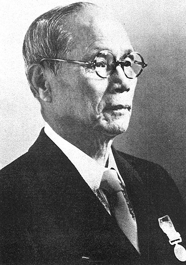
We intend to reflect on these words left by the founder, Kyugoro Sakata, as we celebrate the 110th anniversary of our founding. We will work to continue providing society with the cultural pleasure of hands-on innovation through the act of “writing”, and continue to carry on that value – because it is the Sailor Pen that pioneered Japanese domestic fountain pens, we recognize that it is Sailor’s responsibility to continue producing innovative writing implements and to strive to further expand our corporate perspective and market.

Kure is a port city that has a long-accepted continental culture as the main transportation artery. The history of its development and the technological capabilities that have been constantly refined today’s world is parallel to the land characteristics of Kure. The fountain pen, an imported product a century ago, will be transmitted from here to the world with Japan’s high technological capabilities and aesthetic sense by the pioneering spirit of Kyugoro Sakata.
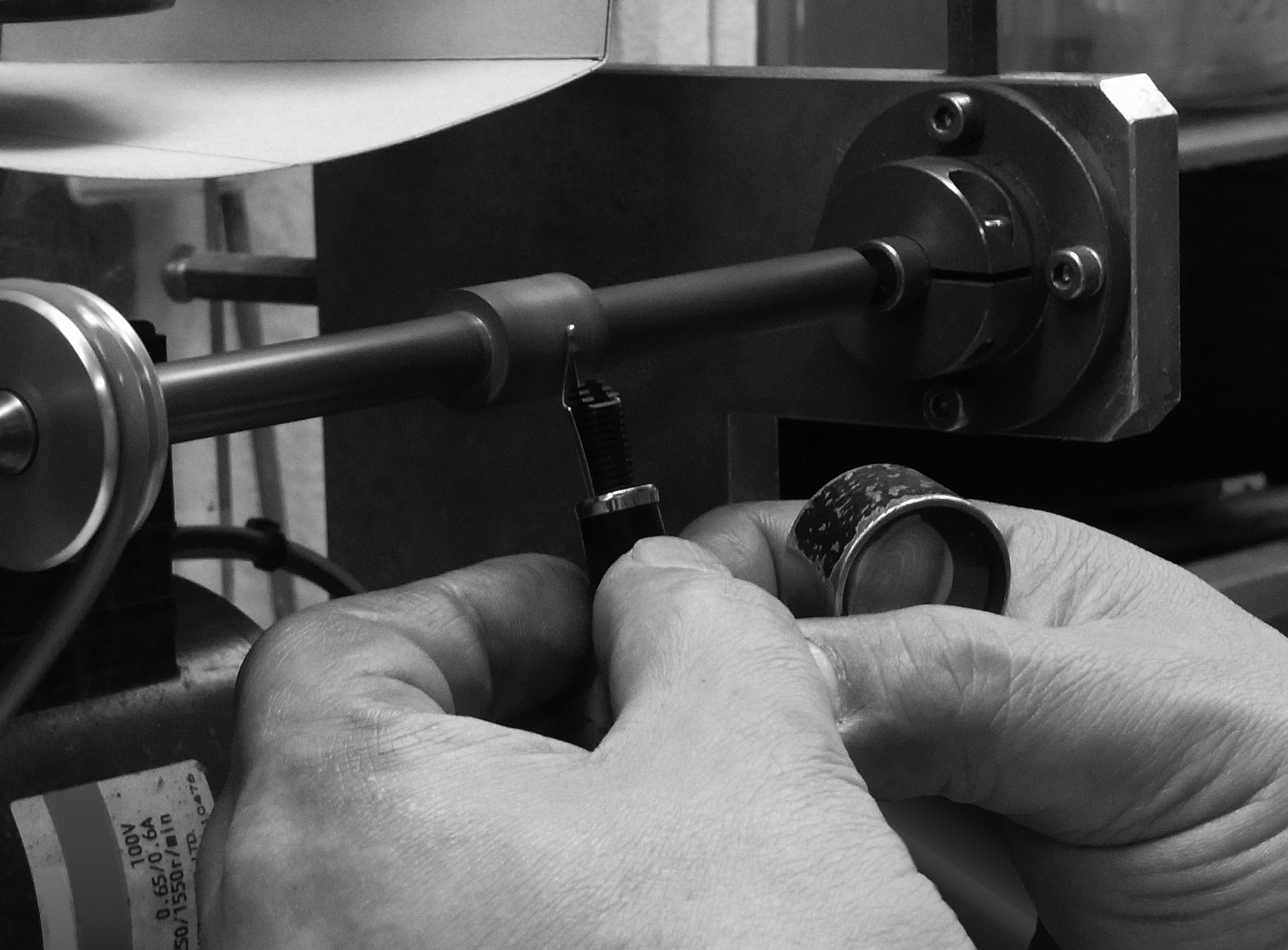
There are many who choose a Sailor Pen over the countless other brands of writing instruments available. Our desire to “satisfy our customers” has sometimes elicited unconventional ideas and playful creativity, and has driven us to pursue further potential functions. “Be a writer who has a strict eye while continuing to be a pioneer in supporting the handwriting culture” is our drive to advance Sailor’s technology. Since our founding, the deep-rooted commitment within us has helped to focus on even the finest details of the technology and brings out the true beauty of our product.
Customers who possess a Sailor’s writing instrument are bound to feel the beauty backed by the function and will be filled with the joy to express it through innovation. We will continue to create instruments that inspire people’s sensibilities because our thoughts and the spirit of taking on challenges continue. We believe that the power to boldly move forward is guaranteed to open up the future.
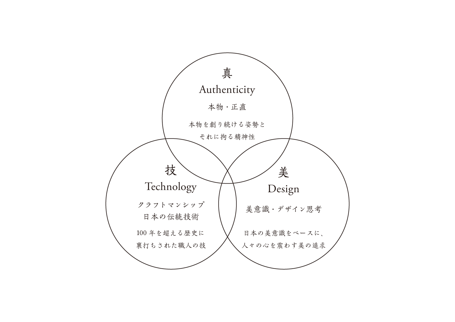
Attitude to keep making the genuine article and spirituality to stick to it
Japanese craftsmanship backed by a history of over a century
Pursuit of beauty that taps into people’s sensibility based on Japanese aesthetic consciousness
In Truth, we keep chasing only the “genuine”, while having the courage to throw away the non-genuine ones. In Technique lives the idea that no matter how many times you try, there is no final “completion”. That is the difference between “technique” and “work”. Despite being backed by deep-rooted tradition, we always take on the challenge to reach further heights. In Beauty, we sublimate Japanese aesthetics into all products and corporate activities. We continue to seek beauty that touches the hearts of owners and users of our pens. Through the trinity of those three, we aim to be the one and only manufacturer of high-quality fountain pens.
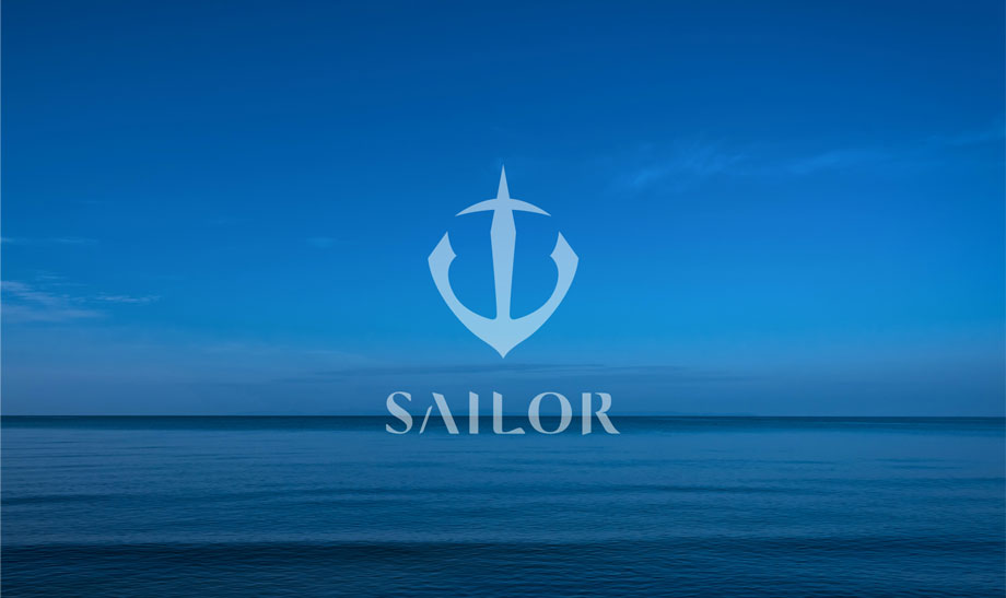
An anchor is a symbol of trust and hope; the ancient Greek word for anchor means “bent arm”, and ancient figures have felt the invisible mysterious energy and the blessing of God in the strong anchor that powerfully holds the ship. For this reason, the anchor has been and will continue to be a symbol of the Sailor Pen. By keeping the “anchor” motif, which is a symbol of hope and trust, and incorporating the strength of technology and delicate Japanese aesthetics into the logo mark, it can be sublimated to the present day with the spirit of the early days of its founding, and to the future.
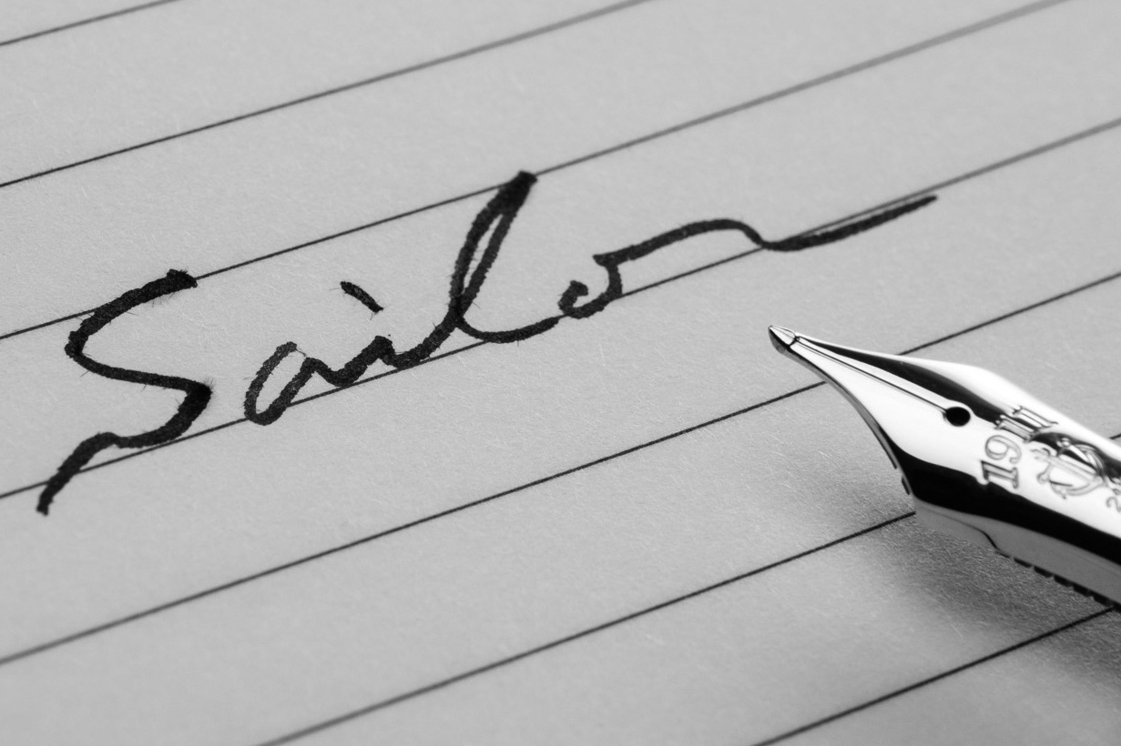
The new logotype is based on the beautiful graphics of the early days when the central heart of The Sailor Pen Co., Ltd. was founded, combined with the Japanese aesthetic drive of finding beauty through simplifying it.
In addition, “SAILOR BLUE-Dawn” has been set as the new CI color. The color is reminiscent of the scenery observed by the founder, Kyugoro Sakata, in Kure, a port city that has a long-accepted continental culture. “Dawn” refers to the time when new things begin and represents the hope for today that is reminiscent of the beauty of the Seto Inland Sea before dawn. We should continue to see this hope in our eyes and our visions for the future. While reflecting on the origin of the CI color and our brand in general, we will set sail for the world beyond the sea to create reliable, quality technology combined with the graceful aesthetic sense of Japanese handicrafts.
FOLLOW US


